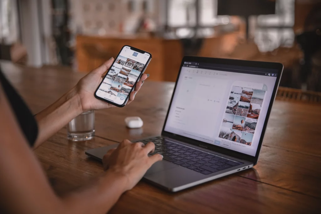
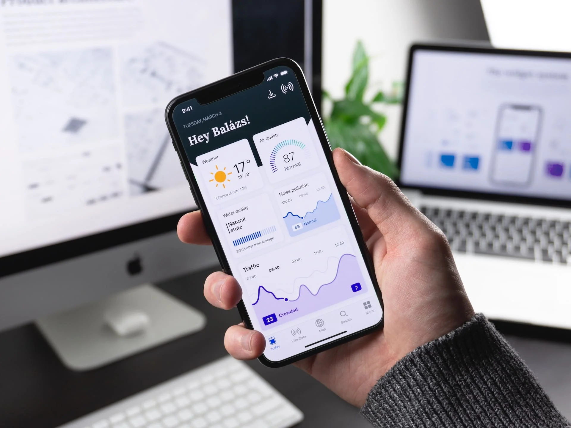
Cell phones and tablets are used by a huge number of people. That’s why adaptive web design is so important – the correct display of a website on any device. Ignoring smartphone users is the same as losing some of your profits. Adaptive web design is a type of layout that takes into account the peculiarities of the parameters of different devices.
Under what parameters the design will have to adjust? The size of a smartphone, computer screen, laptop and other gadgets. Specialists of web studio GTRIX know how to make the system fixes from which gadget is opening a web resource. After that, the selection of a layout suitable for the size of the screen. The resolution is also taken into account.
Not so long ago, representatives of Google made a statement that henceforth follow the principle of mobile-first. This means that the search engine determines whether the online platform has an adaptive design and in what quality. Adaptive is now a must and a standard for those who want to appear as high as possible in the search results.
What’s good about adaptive design
Adaptive design for mobile devices allows their visitors to make purchases. If a web resource is convenient to apply, and it is understandable to users, conversion tends to go up. After all, it is important for the site visitor to make the shopping process as simple as possible. Having an adaptive website design lets users know that their comfort is important and they are taken care of.
There is also no longer a need to create a separate online marketplace for cell phones. Previously, it was impossible to do without a mobile version of the website. This caused a number of difficulties. It was necessary to provide a subdomain, change elements. Now it is enough to add the layout of the existing online site for a smartphone for the correct display of the online site.
To promote the mobile format of the web resource, the owner also invested additional funds. This was due to the fact that in this form the site was created from scratch.
Adaptive effective site allows you to develop and advertise one site, manage content. All because the web resource in different variations is identical for phones and PCs. Optimization differs and SEO strategy.

How to perform adaptive design
Development of sites in Ukraine requires further promotion, including the layout of high-quality adaptive design. This nuance is laid at the very beginning of the work with the online platform. To realize the desired will help such types of flexible design.
- Rubber layout – programmers apply flexible grids that rebuild the web resource to different screen size and orientation.
- Moving blocks – involves moving them down.
- Switching styles based on the device. Creating a quality adaptive design allows you to adjust the site to the desired width, height of the screen.
- Adjustment of elements is carried out taking into account the browser settings.
How can you make your own site adaptive? Programmers emphasize that experiments with the creation of sites in Kiev and adaptive will lead to a useless waste of time and effort. After all, for adaptive quality website uses special plugins.
If the adaptive site create a turnkey, you can buy a ready-made template. A new online platform is developed in an individual design, which by default includes and layout for mobile devices. If the web resource is already working, you can order the adaptive service additionally.
What you need to remember
Always remember the needs of visitors to the site. The more the online platform meets the requirements of users, the higher the likelihood of making a purchase. To do this, take into account the data from Google Analytics, from which devices the potential buyer goes to the web resource.
It does not hurt to ask subscribers what options they want to see, and what they consider unnecessary. You can offer to take a questionnaire to those who have purchased a product online.
To understand how the online marketplace opens on different devices, enter from multiple devices. This is the only way to make a high quality website that visitors will appreciate.
Take into account that developing a quality adaptive website requires adhering to your company’s style. The look of the online platform should match the design of the brand. It is important in all layouts to provide elements in the same colors, the same buttons and characters. Visitors to the web resource should be clear: they are buying a product from the same company, the device does not affect the design.
Why it is better to order adaptive design from professionals
In order for a web resource with adaptive design to function smoothly and attract more visitors, you should use the help of professionals from GTRIX web studio. Programmers will choose a layout that fits perfectly for the customer’s site.
According to the algorithms of search engines, the use of adaptive version is well reflected in the ranking of web sites in search engines. In our team there are savvy developers who know how to get a good result the first time, without regular efforts to edit.
Want to strengthen the position of the site on the Internet? Then use adaptive layout. Thanks to this, the web resource will become convenient for users, and you will be able to take a higher place in the TOP search.
You can discuss the order in detail by signing up through the manager to our specialists. We promptly perform the work and coordinate its results at every stage. Phone numbers of managers are listed on the site.
